Toronto Maple Leafs: Grading Every Reverse Retro Jersey From A-Z

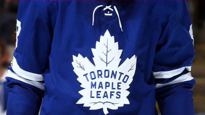
TORONTO, ON - OCTOBER 02: Toronto Maple Leafs logo on jersey during an NHL game against the Ottawa Senators at Scotiabank Arena on October 2, 2019 in Toronto, Canada. (Photo by Vaughn Ridley/Getty Images)
5 of 5
Next
SUNRISE, FLORIDA – FEBRUARY 27: John Tavares #91 of the Toronto Maple Leafs   (Photo by Michael Reaves/Getty Images)
SUNRISE, FLORIDA – FEBRUARY 27: John Tavares #91 of the Toronto Maple Leafs   (Photo by Michael Reaves/Getty Images) /

The Toronto Maple Leafs have a released a “new” jersey and it is just….something special.

For the first time, the NHL has authorized a league-wide alternate jersey theme that was announced a few days ago. These jerseys have garnered mixed reactions from fans, varying from very positive to extremely negative. In this post, I will be grading each retro jersey, including the Toronto Maple Leafs, on my own scale; focusing on the theme, nostalgia, and colour.

As I have previously written about how the NHL is losing female fans by aggressively advertising pink alternatives to us, I do believe these jerseys fair better.

Let’s start with the A Grades:

Anaheim Ducks

Seeing as members of my family still call the Ducks the “Mighty Ducks of Anaheim,” this jersey design was pretty spot on. It gives a nod to their Disney history and is the only retro jersey in the league to feature a team’s mascot. I also appreciate the small details, including how the Duck in the jersey is wearing the same jersey.

Los Angeles Kings

The Kings are bringing back the dynasty! The logo is reminiscent of the Gretzky era with the same colours from their original uniforms in the 1960s and 1970s. They are clearly trying to bring back a time of success and wins, which they desperately need this coming season.

Colorado Avalanche 

The Avalanche have incorporated their current colours and the Nordiques into their newest jersey design. They are very clearly pushing the French influence, with the Fleur-de-lis and igloo logo, and it works much better than say the Toronto Maple Leafs  one.

Arizona Coyotes

The Coyotes’ logo is a perfect example of how to honour Indigenous people properly. The Kachina Coyote was influenced by Arizona’s Native American history and culture. This is probably one of the only things this organization has done right this month.

Brendan Lemieux would be a great addition to the Toronto Maple Leafs
Brendan Lemieux would be a great addition to the Toronto Maple Leafs /

NEW YORK, NEW YORK – DECEMBER 20: Alexander Kerfoot #15 of the Toronto Maple Leafs   (Photo by Bruce Bennett/Getty Images)

The B Grades

New York Rangers

The Rangers jersey design has replaced their usual logo with the Statue of Liberty, a well-known tourist attraction in the State. I love the Rangers logo but feel as if there is a lot of blank space. The logo is just floating against a blue background and I feel so much more could’ve been done on the front.

Vegas Golden Knights

Besides all of the Fluery jokes one can make with this new logo, it is basically an inversion of their original colour schemes. Since they don’t have much of a design history to go off of, I appreciate their newest design.

Winnipeg Jets

I have fallen in love with the Jets jerseys recently. I loved their light blue alternate jersey last year and this current one with a nod to Dale Hawerchuk is great. Unlike with the Vancouver Canucks jersey, I also feel as if these colours work well together.

Washington Capitals

The Washington Capitals truly went retro with their jersey design, using the 1990s design of the Eagle combined with their 2018 Stanley Cup winning colours. During his early years on the team, Ovi himself donned the Eagle logo with a white background,  which I think is even better. It shows how the team has moved forward since then and the true dynasty of Ovechkin.

St. Louis Blues

The St. Louis Blues went with primary colours for their retro jersey design. Red was a decent choice for the jersey as this is one of the colours which catch the eye first and it is pretty unique to the franchise.

Boston Bruins

One of the major changes to this jersey, besides the colour, is bringing back the retro bear on the shoulder patches. I think their original logo, the yellow arch with the bear, might’ve been a better change and nod to history than the late 1980s and 1990s design does.

Carolina Hurricanes

The Carolina Hurricanes went with a jersey design from before they moved to Raleigh. There has been much contention with this jersey design as many feel that the team should not be allowed to use the Whalers logo since they left Hartford.

Calgary Flames

Blasty is back! This horse was a very controversial design and was much hated back in the day. Unlike the Kings, the Flames are bringing back a time of dark history for their franchise. I guess they’re hoping these design will now usher in a brighter future.

Florida Panthers

I actually like the Panthers jersey, and not just because I actually own the original jerseys these are based on and therefore have saved myself some cash. Similar to the jerseys of Ottawa Senators, this team that can frame their design as a rebrand. They recently became the first team to hire a black assistant GM and have a lower age average than last season. I still don’t believe Florida will ever become a hot spot for hockey, beyond All-Star Games and award ceremonies, but this was a chance to garner more fans.

/

NEW YORK, NEW YORK – NOVEMBER 12: Justin Schultz #4   (Photo by Emilee Chinn/Getty Images)

The C Grades

Vancouver Canucks

The Vancouver Canucks chose to keep their modern logo but change the design of the jersey.   They had the option to go for the flying C but instead chose a gradient reminiscent of the 2001 style. I am not too big of a fan of this, as I feel it is neither retro nor nostalgic to any Canucks fan. This is likely because the Canucks have a fresh, young team and are only looking forward.

San Jose Sharks

The San Jose Sharks remixed their usual jersey but added a grey and triangle design. This feels as if a jersey that can be easily incorporated into streetwear. As the Sharks are a franchise already placed in an unlikely area (California), I think this design might help them become more popular with mainstream fashion.

Buffalo Sabres

The Sabres went through 50 designs and chose…this one. I’m glad they didn’t go with their old faithful one (a Buffalo over a pair of Sabres) but still feel there was so much potential here. As well, if someone is still a Sabres fan through all of this, they have likely been for a while and will appreciate the nod to heritage.

Nashville Predators

The Predators jersey, similar to the Bruins, hasn’t changed much but it includes a lot more subtle changes than the others. True fans of the team will appreciate the striping, nicks, and crest that cover the jersey.

/

NEW YORK, NEW YORK – DECEMBER 20: William Nylander #88 of the Toronto Maple Leafs . (Photo by Bruce Bennett/Getty Images)

The D Grades

Pittsburgh Penguins

Pittsburgh had so many choices, whether it be the skating Penguin or the Blue circle, but they chose a boring design. I personally would have loved to see them in any jersey besides this one, which they seemingly chose for such an odd reason “Mario Lemieux won his sixth scoring title during this season….and Snoop Dog.” If the point was to retro, why would a current rapper influence said jersey?

Toronto Maple Leafs

Well, I was very underwhelmed by this jersey. Why are the letters capitalized differently? Why use this Maple Leaf? The designs from this jersey are post-1967, the last time the Toronto Maple Leafs won the Stanley Cup. While other teams are embracing their past dynasty, the Leafs are embracing their drought. Just seems like an odd choice. Why not use a design from the 1960s decade when they won the Cup four times?

Ottawa Senators

I appreciate the Senators historical jerseys from their inaugural season as a way to “start fresh” with their rebranding. However, while they like to act as if they have a young, fresh, franchise, they’re holding an ageing roster, with the youngest player being Brady Tkachuk  (age 21). According to CapFriendly and Elite Prospects, the average age of forwards on the Ottawa Senators is 26.8. Maybe these new jerseys will allow their fans to forget all of their problems.

Philadelphia Flyers

The Flyers have a hard jersey to like, there is so much more orange! However, I like the toned-down orange and the use of black and white to give our eyes a nice rest from being blinded.

Edmonton Oilers

Similar to the Flyers, I appreciate the Oilers refrain from too much orange, and similar to the Kings this is a nod to The Great One’s dynasty. Of course, it might’ve been nice if they used their Todd McFarlane design for a bit of a change-up, but we know how tentative the NHL is towards change.

Tampa Bay Lightning

Sorry, are we sure this is a new jersey? Not much has changed here. The blue base is from their 2020 Stanley Cup run season and is based off their 2004 Stanley Cup run. One of the reasons I don’t rank this as an F is because of their history. I appreciate how they’ve incorporated their past Stanley Cup runs into the new jersey.

Columbus Blue Jackets

Wow, there is so much going on here but it is all rooted in their history. The Blue Jackets are perhaps the leagues most patriotic team, with their jersey themes being based around the Ohio civil war. Although it is a bit difficult to decipher, the logo is intended to represent the 13 colonies of Ohio in the shape of a C and J. Similar to the Wild, this jersey is a bit hard to understand at first and a casual fan would likely be confused.

Minnesota Wild

Unlike my critique of the Dallas Stars, this jersey is contrasted with green and yellow decently enough that it should still pop on the ice. While I do think their original design, which is mostly green, better matches the team’s identity, this design is a homage to the North Stars and who can complain about that?

Toronto Maple Leafs
Toronto Maple Leafs /

Tony DeAngelo? (Photo by Elsa/Getty Images)

The F Grades

New Jersey Devils

The New Jersey Devils jersey is made up of red and green tones. My first thought upon seeing this is “Christmas time has come early this year!” Of course, they didn’t have much to work with unless they wished to copy their AHL teams design but I really cannot stand how this jersey looks.

Detroit Red Wings

This is basically just their practice jerseys. As the Red Wings are an original 6 team, they have so much history to go off of and thus the bar is already pretty high. Their jersey is based on what they wore during their ninth Stanley Cup Championship and in the Centennial Classic, but really just looks like what prospects wear at training camp.

The jersey doesn’t scream about this long history (like the Ducks and Hurricanes jersey do) and I really think this is not worth the money. It is very bland and unoriginal.

Montreal Canadians

I really like how the darker blue looks but, similar to the Islanders critique, it is basically just a new colour. Once again, they had so much potential (such as the 2008–10 heritage classic) and have just used a darker hue?

New York Islanders

The New York Islanders teased the fisherman logo and then produce….a darker version of their current logo. What even is the point of this? They then released a backpack collaboration with the Fisherman logo, but the retro jersey shows that much not has changed since their inaugural season in 1972.

Dallas Stars

What. An. Eyesore. I actually really liked the Dallas Stars’ jersey during the 2020 NHL Winter Classic but this version has too much white. I also image these will look worse when contrasted against the white ice as well. No one has worn white skates since the California Golden Seals!

Chicago Blackhawks

I honestly feel as if the NHL is trolling us at this point. They had the opportunity to make a jersey without the racist logo but instead just take pictures sideways or from behind.

dark. Next. The Ten Worst Trades in Leafs History

What is the point of that? As USA Today says, it just shows the logo needs to be changed.
Next