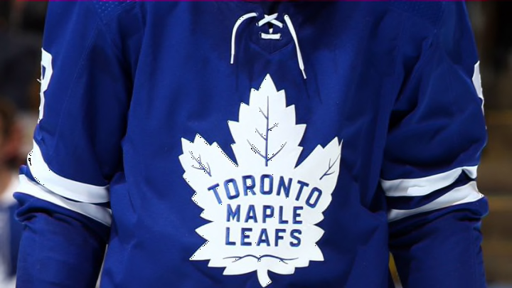
NEW YORK, NEW YORK – DECEMBER 20: William Nylander #88 of the Toronto Maple Leafs . (Photo by Bruce Bennett/Getty Images)
The D Grades
Pittsburgh Penguins
Pittsburgh had so many choices, whether it be the skating Penguin or the Blue circle, but they chose a boring design. I personally would have loved to see them in any jersey besides this one, which they seemingly chose for such an odd reason “Mario Lemieux won his sixth scoring title during this season….and Snoop Dog.” If the point was to retro, why would a current rapper influence said jersey?
Toronto Maple Leafs
Well, I was very underwhelmed by this jersey. Why are the letters capitalized differently? Why use this Maple Leaf? The designs from this jersey are post-1967, the last time the Toronto Maple Leafs won the Stanley Cup. While other teams are embracing their past dynasty, the Leafs are embracing their drought. Just seems like an odd choice. Why not use a design from the 1960s decade when they won the Cup four times?
Ottawa Senators
I appreciate the Senators historical jerseys from their inaugural season as a way to “start fresh” with their rebranding. However, while they like to act as if they have a young, fresh, franchise, they’re holding an ageing roster, with the youngest player being Brady Tkachuk (age 21). According to CapFriendly and Elite Prospects, the average age of forwards on the Ottawa Senators is 26.8. Maybe these new jerseys will allow their fans to forget all of their problems.
Philadelphia Flyers
The Flyers have a hard jersey to like, there is so much more orange! However, I like the toned-down orange and the use of black and white to give our eyes a nice rest from being blinded.
Edmonton Oilers
Similar to the Flyers, I appreciate the Oilers refrain from too much orange, and similar to the Kings this is a nod to The Great One’s dynasty. Of course, it might’ve been nice if they used their Todd McFarlane design for a bit of a change-up, but we know how tentative the NHL is towards change.
Tampa Bay Lightning
Sorry, are we sure this is a new jersey? Not much has changed here. The blue base is from their 2020 Stanley Cup run season and is based off their 2004 Stanley Cup run. One of the reasons I don’t rank this as an F is because of their history. I appreciate how they’ve incorporated their past Stanley Cup runs into the new jersey.
Columbus Blue Jackets
Wow, there is so much going on here but it is all rooted in their history. The Blue Jackets are perhaps the leagues most patriotic team, with their jersey themes being based around the Ohio civil war. Although it is a bit difficult to decipher, the logo is intended to represent the 13 colonies of Ohio in the shape of a C and J. Similar to the Wild, this jersey is a bit hard to understand at first and a casual fan would likely be confused.
Minnesota Wild
Unlike my critique of the Dallas Stars, this jersey is contrasted with green and yellow decently enough that it should still pop on the ice. While I do think their original design, which is mostly green, better matches the team’s identity, this design is a homage to the North Stars and who can complain about that?
