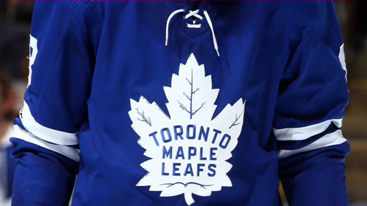
NEW YORK, NEW YORK – DECEMBER 20: Alexander Kerfoot #15 of the Toronto Maple Leafs (Photo by Bruce Bennett/Getty Images)
The B Grades
New York Rangers
The Rangers jersey design has replaced their usual logo with the Statue of Liberty, a well-known tourist attraction in the State. I love the Rangers logo but feel as if there is a lot of blank space. The logo is just floating against a blue background and I feel so much more could’ve been done on the front.
Vegas Golden Knights
Besides all of the Fluery jokes one can make with this new logo, it is basically an inversion of their original colour schemes. Since they don’t have much of a design history to go off of, I appreciate their newest design.
Winnipeg Jets
I have fallen in love with the Jets jerseys recently. I loved their light blue alternate jersey last year and this current one with a nod to Dale Hawerchuk is great. Unlike with the Vancouver Canucks jersey, I also feel as if these colours work well together.
Washington Capitals
The Washington Capitals truly went retro with their jersey design, using the 1990s design of the Eagle combined with their 2018 Stanley Cup winning colours. During his early years on the team, Ovi himself donned the Eagle logo with a white background, which I think is even better. It shows how the team has moved forward since then and the true dynasty of Ovechkin.
St. Louis Blues
The St. Louis Blues went with primary colours for their retro jersey design. Red was a decent choice for the jersey as this is one of the colours which catch the eye first and it is pretty unique to the franchise.
Boston Bruins
One of the major changes to this jersey, besides the colour, is bringing back the retro bear on the shoulder patches. I think their original logo, the yellow arch with the bear, might’ve been a better change and nod to history than the late 1980s and 1990s design does.
Carolina Hurricanes
The Carolina Hurricanes went with a jersey design from before they moved to Raleigh. There has been much contention with this jersey design as many feel that the team should not be allowed to use the Whalers logo since they left Hartford.
Calgary Flames
Blasty is back! This horse was a very controversial design and was much hated back in the day. Unlike the Kings, the Flames are bringing back a time of dark history for their franchise. I guess they’re hoping these design will now usher in a brighter future.
Florida Panthers
I actually like the Panthers jersey, and not just because I actually own the original jerseys these are based on and therefore have saved myself some cash. Similar to the jerseys of Ottawa Senators, this team that can frame their design as a rebrand. They recently became the first team to hire a black assistant GM and have a lower age average than last season. I still don’t believe Florida will ever become a hot spot for hockey, beyond All-Star Games and award ceremonies, but this was a chance to garner more fans.
