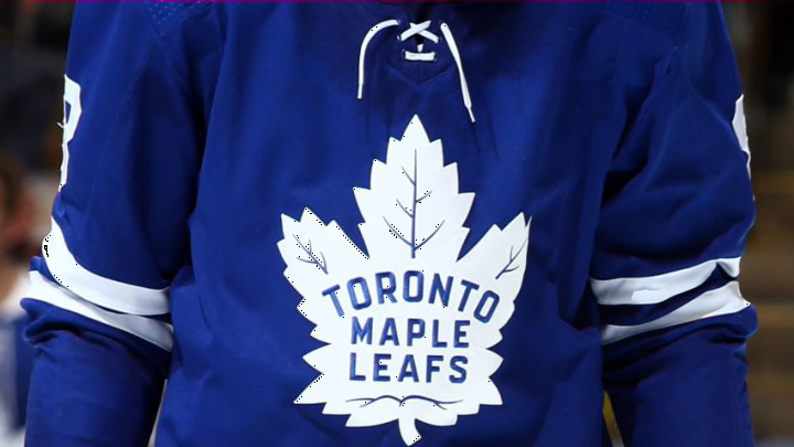
The Toronto Maple Leafs have a released a “new” jersey and it is just….something special.
For the first time, the NHL has authorized a league-wide alternate jersey theme that was announced a few days ago. These jerseys have garnered mixed reactions from fans, varying from very positive to extremely negative. In this post, I will be grading each retro jersey, including the Toronto Maple Leafs, on my own scale; focusing on the theme, nostalgia, and colour.
As I have previously written about how the NHL is losing female fans by aggressively advertising pink alternatives to us, I do believe these jerseys fair better.
Let’s start with the A Grades:
Anaheim Ducks
Seeing as members of my family still call the Ducks the “Mighty Ducks of Anaheim,” this jersey design was pretty spot on. It gives a nod to their Disney history and is the only retro jersey in the league to feature a team’s mascot. I also appreciate the small details, including how the Duck in the jersey is wearing the same jersey.
Los Angeles Kings
The Kings are bringing back the dynasty! The logo is reminiscent of the Gretzky era with the same colours from their original uniforms in the 1960s and 1970s. They are clearly trying to bring back a time of success and wins, which they desperately need this coming season.
Colorado Avalanche
The Avalanche have incorporated their current colours and the Nordiques into their newest jersey design. They are very clearly pushing the French influence, with the Fleur-de-lis and igloo logo, and it works much better than say the Toronto Maple Leafs one.
Arizona Coyotes
The Coyotes’ logo is a perfect example of how to honour Indigenous people properly. The Kachina Coyote was influenced by Arizona’s Native American history and culture. This is probably one of the only things this organization has done right this month.
